


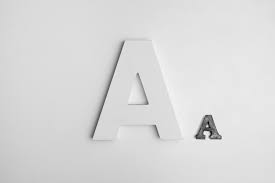
Fonts are quietly powerful. You use the right one on a website, a flyer, whatever, and your whole vibe shifts. It’s wild to think about it! Creative fonts aren’t just there to look pretty; they’ve got an attitude. They shape the whole mood of a project. For example: pick Comic Sans for a wedding invite, and such a grand event suddenly becomes, well…comical.
Now, how do you pick the right font? Whether you’re looking through free fonts or preparing to buy fonts online for commercial use, it’s about matching the look to the message. Below, we will show you 10 solid fonts that can boost the style and readability of your next project.
-
Montserrat – Sleek, Modern, Versatile
You can easily consider Montserrat when you decide to purchase fonts online. It takes its inspiration from the early 20th-century Buenos Aires signage. Montserrat mixes traditional and modern design principles without any clashes. The typeface’s precise forms and structured geometry enable its use in diverse applications. These range from website development to print advertising campaigns.
Websites, branding, digital posters, etc., would benefit a lot from this font. The reason why it works is that it’s clean and readable, but not in a boring way. So, the designs look neat and feel warm.
-
Raleway – Elegant with a Creative Edge
Raleway is graceful without being stiff. It’s a lightweight sans-serif that has enough flair to feel upscale. However, it still works well in casual layouts. Designers often pair it with bolder typefaces or use it as a standalone to give breathing room to high-end visuals.
Raleway is a great choice for your designs since it’s stylish and refined without going too overboard with it. Perfect for showing off your portfolio online, advertising art shows, and anything fashion-related.
-
Playfair Display – Classy but Creative
This serif typeface has a certain charm, giving a sort of editorial quality to your creations. While drawing inspiration from classic letter designs, it incorporates a modern flair. The lines are thicker and thinner in cool ways, and the curves give it some serious personality. Perfect when you want something that looks good and is easy to read.
All your creative stuff is bound to look super classy when Playfair Display is by your side. It suits magazine designs, photography websites that look fancy, and any design work that needs to feel upscale.
-
Bebas Neue – Simple, Strong, and Stylish
Bebas Neue is this sans-serif font that has everything in all caps. It is straightforward; think clean lines, tall letters, and a narrow shape. So, use it when you need a title to really grab attention. It’s not fancy or anything. Bebas Neue is striking, simple, and powerful. That’s the reason it’s so handy.
Why use it? Bebas Neue makes headlines and slogans jump right off the page, without any distractions. It’s perfect for poster designs, whipping up online advertisements, and making those cool graphics that pop up in social media campaigns. Pretty neat, if you ask us.
-
Pacifico – Laid-Back and Distinctive
Pacifico evokes the very essence of summer. It has a cool, handwritten style that’s relaxed and chill. You probably wouldn’t want to use it for a ton of writing. But it’s a good choice for things like highlighting keywords, making logos pop, and jazzing up titles.
Basically, it gives off a friendly, personal touch. Pacifico works best for creative brands, cool merch designs, and making invitation headings look extra special.
-
Futura – Geometric and Timeless
Futura is a veteran at this point, kicking around since the 1920s. It is still used by designers who prefer clean, structured forms. It works beautifully in layouts that need order but still want a touch of style. This font is often used in minimalist design systems in creative works.
Futura is well-structured yet stylish, so it’s excellent for clarity. It works well with creative portfolios, neat layouts, typographic posters, etc.
-
Oswald – Built for Bold Digital Design
Oswald was made for digital screens. It’s a reworking of traditional Gothic digital fonts with changed proportions. It provides a strong, easily readable, and new appearance that is perfect for designs that need a quick impression.
Futura is striking and digitally native. It is fit for a variety of tasks. Instances include campaign visuals, banner graphics, and creative web design.
-
Brush Script – Artistic with Personality
Brush Script gives a layout a painted, artistic feel. It’s exciting, emotional, and perfect for short times when you want to show your creativity. It works best when used in small amounts; think about taglines, short titles, or creative labels.
Use the Brush Script font to add style and motion to a still layout. It is great for art project titles, creative product packaging, and event posters.
-
Garamond – Subtly Chic
Although often seen in printed materials and books, Garamond has found a fresh place in creative design projects that aim for a vintage or traditional look. It offers a sense of calm confidence. But with the right approach, it can seem modern and artistic.
Garamond combines intricacy with a touch of style. Designers may use it for creative zines, traditional-style posters, branding for handmade products, and more.
-
Lobster – Intimate and Vibrant
The script font Lobster stands out on the page. It is a good option for designs that aim to feel warm, lively, or crafted by hand. The strong, brush-type letters are the reasons behind this distinctive look. It often shows up in creative branding, signs, and product packaging.
Lobster is full of character and easy to recognize. So, it is a solid choice for menu boards, bakery logos, and fun design projects.
A Few Words About Using Fonts in Silhouette Studio
To get downloadable fonts that are not from the Design Store:
- Download the .ttf or .otf file.
- Install it on your computer.
- Close and reopen Silhouette Studio. New fonts will appear in the ‘Text Style’ menu.
To get fonts from Design Store aka the best place to purchase fonts:
- Open Studio.
- Click on ‘Store’ in the top-right corner.
- Browse or buy font(s).
- They will immediately appear with thumbnails under the library’s ‘Fonts’ section.
Organizing your own fonts:
- You can see installed fonts in the ‘Text Style’ panel and type to search for them.
- Try to preview the fonts quickly before installing them to get a basic idea about their appearance. This would help prevent undesired installations.
Final Words
Fonts are like the voice of your visual design. The correct font will bring your work from ordinary to remarkable. There are many choices in the world of creative design, including well-known fonts like Montserrat and unique styles like Pacifico or Brush Script.
So, avoid making font selection a last-minute decision the next time. Try out different styles, play around with combinations, and allow your text to express itself as stylishly as your images. Your design deserves this.
- Top 10 Creative Fonts to Elevate Your Next Design Project
- Discover the top 10 creative fonts to enhance your next design project. Add style, personality, and flair with these standout typeface choices.
- Creative Fonts, Free Fonts, Purchase Fonts Online, Best Fonts, Downloadable Fonts, Best Place To Purchase Fonts, Digital Fonts
Related posts:
 Fitness for Mental Clarity: Unlock Your Focus and Inner Strength with DG FIT MIND
 Top Carrier Oil Suppliers in India for Bulk & Wholesale Buyers
 Atlas Pro ONTV : La Révolution de la Télévision par Internet
 Luxury or Budget? Finding the Right Heathrow Transfer for You
 What Is Cold Rolled Stainless Steel Coil and Why Does It Matter?
 Make Impact with Commercial Signs Raleigh NC: A Strategic Guide to Business Success
 PEX vs Copper in New Homes: What’s Right for You? | Creative Repipe
 Make Your Message Stick: The Power of Flyers & Posters in Plano!


